 Prompt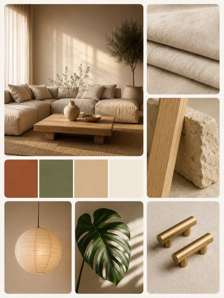
A Renovation Moodboard Before You Buy Anything
Prompt
{
"subject": "An interior decor moodboard for the renovation of a living room, laid out as a collage of seven rectangular cards with rounded corners, each card a different reference for the same project: the finished room, the materials, the palette and the details.",
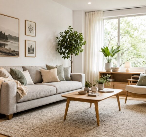
"scene": "The seven cards, and nothing else. (1) The large photograph of the room: a modular sofa in sand coloured linen with crumpled linen cushions, a low, solid coffee table in pale wood, a woven jute rug, a matte ceramic vase holding an olive branch, a sheer curtain filtering the light from a tall window and a potted olive tree in the corner. (2) Raw linen fabric, folded, with the weave in plain sight. (3) A strip of pale, open grained wood leaning against a block of rough limestone. (4) The palette strip: four colour rectangles side by side, with no name written on them. (5) A rice paper pendant lamp against a pale wall. (6) A monstera leaf lit from the side. (7) Two cylindrical brushed brass handles on a pale surface.",
"composition": "A 3:4 portrait. An irregular grid of seven cards filling the whole frame, with a narrow, even thread of background between them. The photograph of the room is the dominant card: it sits at the top left and on its own takes up close to half the area of the frame. The palette strip runs across the width of the left column just below it. The material and detail cards spread through the right column and the bottom band, from the largest to the smallest. No card overlaps another, none is cut off by the edge of the frame, and no large empty area of background is left over.",
"camera": "Each card is a photograph of its own. The one of the room is a wide shot at the eye level of someone sitting down, with the back wall parallel to the frame. The material and detail ones are close ups shot almost from above, with a shallow depth of field, the focus on the foreground and the background blurred.",
"lighting": "Diffuse natural late afternoon light coming from the left. Inside the photograph of the room it draws long, soft shadows on the floor and on the wall. Outside it, each card gets a short, soft shadow underneath, as though it were simply resting on the background. No hard shadow and no strong specular highlight.",
"color_palette": "The four rectangles of the strip, in this order: burnt terracotta, olive green, sand and warm white. The whole frame stays in those same tones, and the dark green of the leaf is the only saturated point in the image. An off white background of lightly textured paper. Low saturation, warm temperature.",
"style": "Editorial photography from a decor magazine, realistic, with a printed, matte finish. No 3D rendering, no illustration and no stylised filter.",
"materials": "Raw linen, pale open grained wood, rough limestone, woven jute, rice paper, matte ceramic and brushed brass.",
"details": "No card is identified by a label: what tells you what each one is are the texture and the colour seen up close, which is why the materials appear large enough for the weave of the linen, the grain of the wood and the pores of the stone to stay visible. The palette strip repeats exactly the colours already present in the photograph of the room, and it is that repetition that makes the set read as a single project rather than as seven pretty images side by side.",
"negative_prompt": "text, letters, numbers, labels, tags, colour names, captions, watermark, logo, real brand, people, hands, a frame around the set, a card overlapping another, a card cut off by the edge, scissor cut outs, sticky tape, pins, dark background, cool colours, high saturation, hard shadow, AI artefacts"
}
How to use
An expensive renovation is the one decided at the shop counter, one piece at a time, and only at the end do you find out that the wood is fighting with the floor. A moodboard reverses the order: the whole set on screen first, the buying afterwards. It works in ChatGPT, Gemini and NanoBanana. 1. Swap the scene field for your own room and your own materials. It is the field that describes each of the seven cards. 2. Rewrite the color_palette with your four colours. They have to be the same ones that appear in the photograph of the room, otherwise the board turns into a collage. 3. Keep the materials field close up on texture: it is the weave of the linen and the grain of the wood that say what each card is, since none of them carries a label. 4. Leave the composition alone: it is what holds the grid of seven cards together, with the large photograph at the top. 5. Take the image to the shop and compare it against the physical sample. Screen colour lies: the board picks the combination, not the exact shade. Tip: generate two versions with different palettes and choose before you spend.
Works with
ChatGPT
Gemini
NanoBanana
Rate this prompt
📋 Featured in these lists

📖 From the Prompteiro blog
See all posts →
Try a Haircut With AI Before You Actually CutImages · September 9, 2026

Colourise Black and White Photos With AI: A GuideImages · September 7, 2026

AI Headshots for LinkedIn: The Complete GuideImages · September 4, 2026

Pet Photo Prompts: How to Get It Right First TimeImages · September 1, 2026

What ChatGPT Keeps of Everything You TypeCourses · September 1, 2026

Why ChatGPT Gets Things Wrong and How to Check ItCourses · August 24, 2026

How to Create an AI Image From Your Own PhotoCourses · August 19, 2026

AI for Studying: Exams, Tests and LanguagesText · August 18, 2026

Free AI: What You Can Do Without Paying AnythingCourses · August 12, 2026